Add Color to a Drab Space Like an Interior Designer
Professional interior designers love a neutral color. These soft, natural colors make a great canvas to build on. Furniture and flooring in colors like sand, fawn, and slate gray give us unlimited opportunities to dress them up. The only downside is their tendency to look drab, dull, and even depressing.
With this blog post, we’re going to address ways to add vibrant color back into a drab space. From enhanced lighting to gorgeous pillows, the team here at Matter Brothers Furniture Store in Naples is ready to help!
What Is a “Pop of Color” and How to Use One
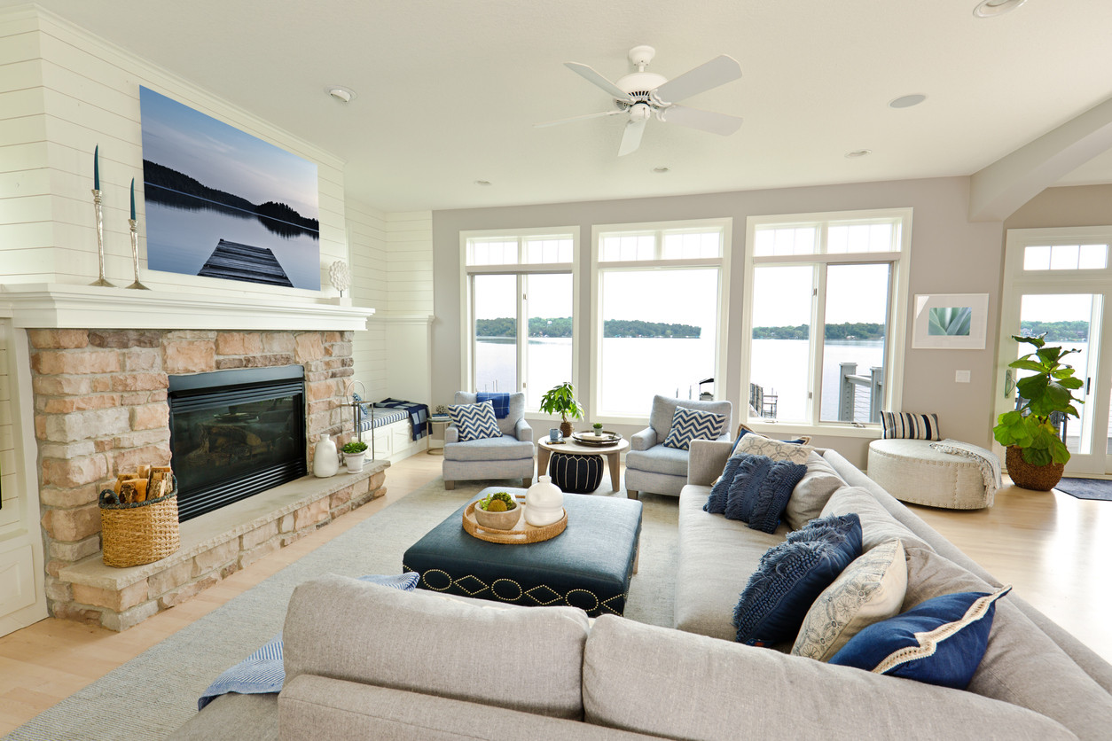
When interior designers talk about adding a “pop of color,” they mean to add a few finishing touches in a well-saturated (vivid) bright color. Imagine the room you’re sitting in right now, composed of entirely neutral beige and tan. In your mind’s eye, throw a few bright red or blue pillows on the furniture. See the difference?
But we’re getting ahead of ourselves here. Before we get to those colorful finishing touches, let’s talk about a few other concepts which are essential when breathing new life into a drab room.
Lighting Matters
No matter how many vivid colors you throw around a room, they’ll still appear drab if the room is poorly lit. Before you make any furniture or decor purchases, address the lighting:
- Pull back the curtains and lift the blinds to let in plenty of sunlight.
- Clean windows well, inside and out.
- Make sure any skylights are clean.
- Replace any missing light bulbs in overhead lighting or ceiling fans.
- Increase the lumens (not wattage) in the bulbs you have installed in lamps.
- A room you’ll be working or reading in needs lighting around 450 lumens.
- Consider purchasing additional lighting if your room still needs a boost of light.
Florida is naturally breezy and sunny (when it isn’t raining). You may find that addressing the lighting lifts the “mood” of a room tremendously!
Select Your Colors Like a Professional Interior Design Specialist
Now that you’ve turned on the lights, it’s time to build on the colors in the room. A good place to start is the color wheel. We love this interactive tool by Sessions College for Professional Design. It’s a great way to play with colors before you make any purchases. Try these techniques:
- Choose the two most common colors in a room and combine them with the color tool. You’ll achieve a third color made from these two. Purchase your accessories in this third tone to “bring together” your original two colors.
- Or, find the most overwhelming color in your drab space and select a bright, contrasting color from the color wheel. Contrasting colors look shockingly great together. (That’s why black and white look so sharp when paired together.)
- Play around! It takes only a few minutes to get some fresh ideas.
Once you’ve picked some color options, head over to our Naples furniture store to find the pieces you need!
Implement the Colors You’ve Chosen
Colorful area rugs, plush pillows in vivid hues, and appropriate tabletop accessories are all easy to try (and return for a different color if needed.) This author likes to start from the floor up, beginning with a large, vibrant area rug. From there, we can add a few brilliantly colored pillows, and, finally, add a few accessories like the occasional vase.
Conclusion
What if you’re not ready to commit to a pop of color? We’ve all been there! There’s a reason a professional interior design is a real career. It’s backed by science. Contact us today to talk to design professionals. Take a few pictures with your cell phone of the room you’re looking to refresh and bring them into any of our locations. The staff here at Matter Brothers Furniture would love to help you choose the best colors to rejuvenate your space.