How to Use Accent Colors in Your Home Decor Like a Pro
Designing rooms that are cohesive yet interesting is the key to having a home that exudes style. So, how do design professionals create lively rooms without overdoing it? The 60-30-10 rule. Here’s how to add accent colors in your home like a pro.
60-30-10 Rule
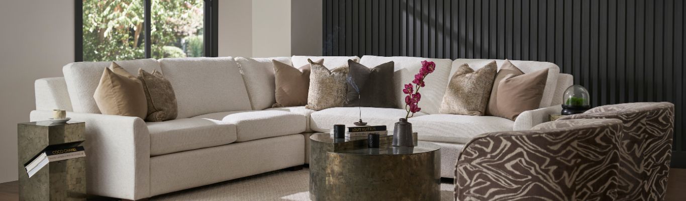
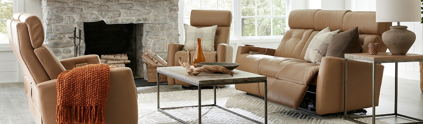
For your space to feel intentional, intriguing, and put-together, keep the 60-30-10 rule in mind. What’s that, you ask? It’s the fool-proof technique of dividing your room’s color scheme into percentages: 60 percent to the dominant color (usually the walls), 30 percent to a secondary color (upholstery and/or furniture), and 10 percent to an accent color (accessories and decor). The dominant color will make your room feel sensible while the secondary color will be used to break up the monotony. However, a room’s personality is found in the accent color. It’s the unexpected aspect that makes each room special. Don’t be afraid to make a statement in your home by choosing a vibrant accent color.
Choosing the Right Palette
Tasteful accents don’t happen by chance. Before you throw some accessories around a space and hope they complement each other, you should choose a color palette to work from. This is where the color wheel can help. Complementary colors, or those colors that can be found opposite each other on the color wheel (purple and orange) work well in more formal areas of the home, such as the living room. On the other hand, analogous colors, those that are touching on the color wheel (blue and violet) are great for informal rooms, such as the bedroom. Regardless of the colors that you choose to pair together, be sure that they are in the same family. Mixing bright colors with muted ones is more challenging than pairing two bright colors or two muted ones together.
Find Your Inspiration
Rather than trying to find random colors to marry, it’s much easier to pull colors from another element within the room. For example, if you plan to use throw pillows with a colorful print or a painting with a bold pattern, choose one or two colors to incorporate elsewhere around the same space. By doing this, you can be confident that the colors work well together and the design looks intentional.
Keep It Balanced
Typically, it’s best to use a neutral palette as your dominant tone, leaving the brighter colors to work as your secondary and accent colors that sporadically pop throughout the space. Let’s say that you choose to decorate a room around a painting that is grey, yellow, and blue. The grey, acting as your neutral tone, could be your dominant 60 percent color, the blue could be your secondary 30 percent color, and the yellow could work as your lively 10 percent color. Additionally, using the same basic color schemes throughout your entire home is an effective way to ensure that your designs flow effortlessly from one room to the next. While you may use yellow as your accent color in your living room, it could fall back to the secondary or even the dominant color in the kitchen, giving each room a fresh atmosphere, while maintaining a unifying theme.
Learn More About Using Accent Colors Like a Pro
Adding spice to your home’s decor through color doesn’t have to be as complicated as it may seem. Keep things simple by applying the 60-30-10 rule, find inspiration in your favorite home furnishings, and don’t be afraid to have a little fun with bold accent colors. For more tips on how to incorporate color into your home like a design pro and for all of your home furnishing needs, Matter Brothers Furniture is the premier furniture store in Naples. Visit us at one of our five showroom locations or contact us today!